How To Create Looker Studio Reports
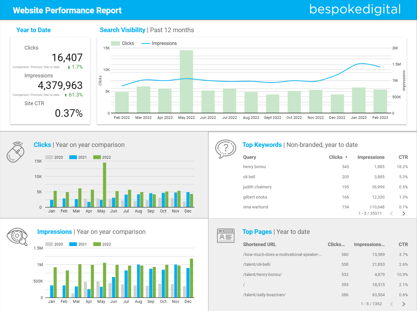
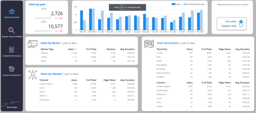
Previously known as Google Data Studio, Looker Studio is a powerful reporting tool that allows you to visualise complicated sets of data, gather your data from multiple sources in one place, and provide real-time updates. For anybody looking to track, analyse, and share their website’s data, Looker Studio is a fantastic way to congregate the information that matters most to you. With Universal Analytics reaching the end of its lifespan, this is even more important than ever before, as Google Analytics 4 doesn’t always offer the clearest path to finding the data you need.
However, learning to use Looker Studio isn’t easy. At first glance, it’s easy to get overwhelmed, especially if you don’t already know how to find what you’re looking for. In this guide, we’ll take you through the basics of Looker Studio and get you on the way to creating your very first personalised reporting dashboard.
What is Looker Studio?
Looker Studio is a free tool that helps you collect data from lots of different sources in one report. Converging and visualising your data makes it easy to analyse and compare, and saves you time switching between manually checking different applications. Looker Studio reports are completely customisable, allowing you a range of design choices to present the data you’re looking for in the simplest way. Reports can be easily shared, and set to update in real time, meaning once you have created a dashboard that works for you, you won’t have to replicate your work month-to-month.
Getting started is fairly simple. As with Google’s other offerings, all you need to do is sign in to Looker Studio using your existing Google account. Once you’re in, you can create a blank report, or choose from some of the many templates Google offers.
Streamline Your Data
As well as combining multiple data streams into one place (e.g. Google Analytics and Search Console data in the one report), Looker Studio is capable of getting really granular with your data. Whilst this is a positive thing, it’s easy to get carried away, and bloat your dashboard with information that it doesn’t really need. Remember that the most effective reports are often the ones that present complex data in the simplest way, and try to stay focused on what you really need to see. Knowing what KPIs you are reporting on early on will help you stay on track and make it easier to build your report with a goal in mind.
If you’re a content marketer looking to measure your ROI, take a look at our guide for advice on where to get started and ideas for building your first report.

Connecting Data Sources
Google offers a variety of connectors, allowing you to directly import your data from a large range of sources. As well as Google connectors, which allow you to access data from the Google suite (such as Google Analytics or Google Ads), partner connectors enable data imports from a variety of popular tools, including Facebook, Microsoft and Mailchimp.
Whilst Looker Studio, and Google’s own connectors, are free to use, many partner connectors require monthly payments to use. Some connectors allow you to reach multiple data sources at once, so if you need to present data you can’t access for free, it may be worth looking into this, or thinking about building your own connectors.
Once you have selected your connector, Google will ask you to authorise the connection. Once you have done so, and followed any additional instructions unique to the particular connector you are using, Looker Studio will have access to use the data on the charts in your dashboard.
Presenting Data
In Looker Studio, data is presented when you apply it to a chart or table. You can create a chart easily using the toolbar at the top of the screen, and choose from a variety of different visual forms, including scorecards, maps, tables, and bar or pie charts.
Once you have created your chart, and added your data to it, you will notice data fields are split into two categories: dimensions and metrics. It may not be entirely obvious what the difference between the two is.
Simply put, a dimension is what you are measuring. In Looker Studio, these are colour-coded in green, and are text-based. For example, “Country”, “Medium” or “Page Title” are all examples of a dimension. A metric, which Looker Studio colour-codes in blue, is used to measure dimensions, and are number based. Duration, currency, or the number of visits to a site are all types of metric.
If this seems complicated, think of it this way: if you want to measure the number of visits to your website on a particular day, the date is the dimension, and the number of visits is the metric. If you want to look at how long different devices are staying on a particular page, the page title and device category are the dimensions, and the duration is the metric. Once you start breaking it down, it becomes simpler to understand, and easier to avoid creating errors in your charts.
If you want to include or exclude data from your dimensions or metrics, Looker Studio allows you to create filters. This is where your dashboard can get really granular. For example, if you only want to report on visits from desktop devices in the UK, you can apply a filter to your charts to do so.
Google will label your data automatically, and some of the labels Looker Studio chooses may need to be renamed. This can easily be edited when working on your charts. When clicking on a chart to edit, there will be a small button next to the name of the dimension or metric in the set-up tab. Hovering over the button will cause it to change to a pen icon, and allow you to change the name.
Take some time to play around with the chart options. Each chart is suited for different types of dimensions and metrics, so getting familiar with them will help you create better reports.
Customising Your Report
Once you’ve got all your charts in place, the next step is altering how your report looks. Looker Studio offers customisable options similar to Google Slides, allowing you to make purely visual changes to include branding or simply add some style to your dashboard using images, shapes, or textboxes.
As well as editing the layout and look of the presentation, clicking on a chart and switching to the style tab will allow you to change how each individual chart looks, including the colours used, the background and border, or adding and removing labels from your data. Charts can be moved and resized the same way as images or text boxes can, allowing for even greater customisation.

Share Your Dashboard
Once you’re happy with your report, it’s easy to share it with those who need to see it. There are two ways this can be done. The first, and most dynamic way, is by sharing a live link. Like the rest of the Google Suite, this can be done by clicking the “Share” button in the top left. The live link will allow anybody who has it to check in at any time, and access the interactable elements of the report. Additionally, you can schedule regular email delivery of the reports to those you want to receive it as a reminder.
If you need to, your dashboard can also be downloaded as a PDF. Simply click file, scroll down to “download as”, and click PDF, and it will save to your device. You can then forward this on as necessary. However, the PDF download won’t be interactable in the way the live link is.
Learn More About Looker Studio
We’ve taken you through the basics of Looker Studio, which should allow you to create simple, but effective, reports. However, Looker Studio is an incredibly powerful tool with many sophisticated features and more advanced capabilities. If you still need support, why not get in touch with our experts?

